 Our neighbors have this little black dog named Sassy, she's some sort of a Labrador Retriever mix, and she takes her responsibilities very seriously! She works really hard to be a good watchdog, barking continually at anyone who rides a bike or jogs down the road. Sassy wants to be so helpful, she's always at our door, ready to greet us. If there's a raccoon or coyote in the area, she will bark until it goes away - even if it takes all night! If one of us pulls our car into the driveway, she runs to greet us and then escorts us home. If someone comes by to visit, she's quick to let everyone know there's a stranger here. I appreciate her willingness to always be on task, but it does get to be a bit much.
 WhenI was trying out the new Quick Properties, frankly, it reminded me a lot of Sassy. It's good to have, like a more-than-willing watchdog, but it can be annoying.
How it works - When the Quick Properties button is on - (these buttons turn blue in 2009 now, what a good idea!) - if you select an object, a smaller version of the properties palette pops up right next to your cursor, with information about that object. 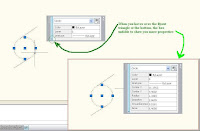 Just like in the normal Properties palette, you can modify the object right there. It's really handy when you need it, and when you don't, just click it off.
 Just like in the normal Properties palette, you can modify the object right there. It's really handy when you need it, and when you don't, just click it off.
Settings
If you right-click on the Quick Properties (from here on out I'm going to abbreviate that to QP) panel and choose "Settings" you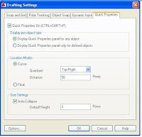 can adjust how this QP panel operates. At the top, decide whether you want to show QP for all object types, or only for defined objects.
The middle section is labeled "Location" and here you can decide where the panel pops up. In Cursor mode, the QP panel pops up relative to the object you selected, and you can enter how many pixels away from your cursor it will be. In Float mode, my personal favorite, the QP panel always displays in the same position on your screen until you manually move it. (Kind of like tying up the dog!)
If you right-click on the Quick Properties (from here on out I'm going to abbreviate that to QP) panel and choose "Settings" you
 can adjust how this QP panel operates. At the top, decide whether you want to show QP for all object types, or only for defined objects.
The middle section is labeled "Location" and here you can decide where the panel pops up. In Cursor mode, the QP panel pops up relative to the object you selected, and you can enter how many pixels away from your cursor it will be. In Float mode, my personal favorite, the QP panel always displays in the same position on your screen until you manually move it. (Kind of like tying up the dog!)
The bottom section is called Size Settings, and here you type in how many lines the QP panel will show when it first pops up. Any additional properties that you want to see will unfold if you hover over the fly-out triangle.
Customize
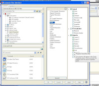 This was well thought out by Autodesk- if you choose "Customize" when you've right-clicked on the QP box, it puts you right into the Customize User Interface dialog box, with the QP section already open for you, creating two columns on the right side of the CUI box. Pretty slick! Whichever object you had selected in your drawing is the one currently showing, with the current properties selected in the farthest right column. You can check whichever properties you really want to see, and uncheck those you don't. Then in the other column, you can also edit any other defined object just by clicking on it. When you select a different defined object, different property choices will show up in the farthest right column, and you can choose which ones to show for every type of object.
 This was well thought out by Autodesk- if you choose "Customize" when you've right-clicked on the QP box, it puts you right into the Customize User Interface dialog box, with the QP section already open for you, creating two columns on the right side of the CUI box. Pretty slick! Whichever object you had selected in your drawing is the one currently showing, with the current properties selected in the farthest right column. You can check whichever properties you really want to see, and uncheck those you don't. Then in the other column, you can also edit any other defined object just by clicking on it. When you select a different defined object, different property choices will show up in the farthest right column, and you can choose which ones to show for every type of object.
I think if you give this a try you'll find it a good tool to have in your repertoire. Set it up so it shows the properties you need to verify the most often, and turn it on whenever you're fixing up someone's drawing. I'm sure Sassy would approve!




No comments:
Post a Comment